Hi there blog friends! I finally got my Little Bird set from PTI and I ran to my stamps to dig out Bird Watching because I just knew these two would go well together. I never cared for the birds in bird watching because they were solid and the houses were outlines. Peeps it needs to be all solid or all outline I do not like the whole solid and outline mixy matchy. Anyway these birds from Little Bitty Bird are the perfect scale for the cute bird houses. I have been a happy girl stamping away today!

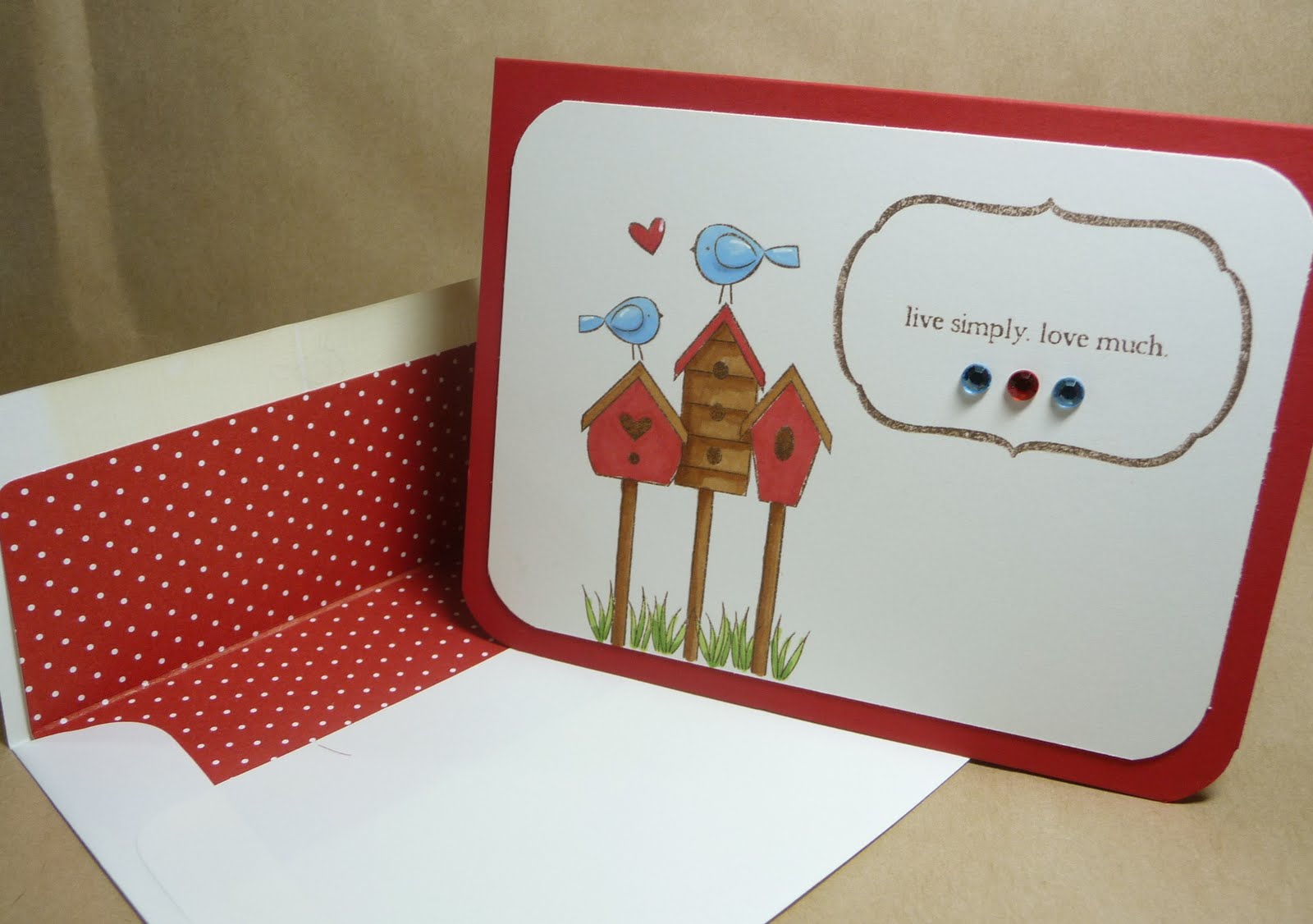
On this first card I mixed my bird houses and bitty birds with one of my fillable frames sets. I colored everything using my copics. Let me offer you a little tip here, if you are coloring on PTI's vintage cream the copics are going to spread more than normal. So stay back away from the line. Give the color somewhere to move to. Also the darker the color the more it bleeds so when using dark brown or dark red be really careful.

This card I took the same basic stamping "picture" and trimmed it closer. Colors and "picture" are basically the same, however I added two more hearts to make the picture more vertical for my vertical card. Its colored almost identical to the first one. I added a fillable frame that I matted on some red bitty dot paper. I paper pieced two of the hearts and then colored the bird to match. I also used my white gel pen to add a little border to the longer picture.

Next is the details... now I dont always do these things. Sometimes I am too tired or too hurried. But its the details that really make a project stand out. Take the back of the envelope for instance- here I added a little bird and the word hello. What a nice little surprise for the recipient. Thats not something you find at hallmark.

Here I lined the envie with bitty dot paper. If you have the PTI envie die this is a simple and easy step. Sure the envelope might get tossed. Who cares? Look at the impact this has. This makes people stop and say Wow!

And finally we have the front of the envie. The fillable frames make the perfect address frames. So quick and easy to do. If you have a little extra time add one of the stamps you used on the card or a coordinating stamp. Here I have two little birds and the heart. I generally dont color on envies because of the whole bleeding thing but if you wanted to you could. Just slip a little scrap of card inside to soak up the ink. Easy peasy and really worth the extra effort to make something stand out.